Edifecs.com Redesign Web Design Development CMS B2B
Rebuilding and redesigning the main corporate site over the course of a year+. Made the site responsive, performant, and more usable. Traffic and other success metrics have all improved. The redesign focused on modern development practices, modular design, and better user journeys for researchers, decision makers, and customers.
Responsive Design
Transformed a 2010-era desktop-only site into a fully responsive platform that works seamlessly across all devices.
Performance Optimization
Implemented best practices to achieve consistent 60fps rendering and fast page loads, improving user experience significantly.
Traffic Growth
Increased site traffic while reducing bounce rates, generating more leads and training sales through improved user journeys.
Modular Architecture
Created reusable content modules and standardized page layouts, enabling faster content creation and consistent experiences.
Problem
The site (1.0) was built in 2010 and did not receive any major updates until the rebuild. During that time, responsive design was not yet common for B2B enterprise companies. The design lacked focus, often copying common design patterns from competitors. As the company's headcount ballooned year after year, ensuring the corporate website attracted good talent became critical.
Key Issues:
- Not responsive - desktop-only design
- Design cluttered and unfocused
- Messaging stale and outdated
- Many technical issues and performance problems
- SEO and SEM problems affecting discoverability
Solution
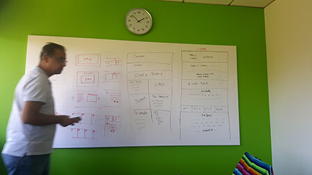
Built a new modern site (2.0) with a committed focus on web as a platform to better market, educate, and engage customers. This was not a simple reskin or slight enhancement, but a complete overhaul. Site 2.0 had all content, graphics, and code redone from scratch. A large multi-department project formed to complete this 1+ year initiative.
An important change in mindset was adopted: core pages were no longer independent of each other. The user's journey on a website is just as much a part of the sales journey as anything else. Content was written in sections with the concept that it would be plugged into other pages as needed.
Impact
- 100%
- Responsive
- 60fps
- Performance Target
- ↓
- Reduced Bounce Rate
- ↑
- Increased Traffic
Technology
We selected technologies that enabled modern development practices and marketing automation:
Target Users
The redesign focused on three key personas:
- Researcher: Often the first contact in the sales chain, spends time reading about solutions, passes information to decision makers
- Directors+: Decision makers involved near the end of sales cycles, spend time reading through additional offerings
- Customer: Already using the solution, looks for documentation and trainings on solutions they're using
Design
Two primary design goals were achieved: tell a better, more cohesive story on the homepage, and simplify design templates to more easily produce new pages as needed.
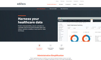
Homepage
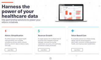
Company homepages are often the first page a new or returning user lands on. 2.0's homepage uses a concept of 100% sections. It's often difficult to deliver a direct message when a large B2B company offers many solutions. By using the 100% method, only one direct message is used per section. Scrolling slides the user into the next or previous section. Content and messaging don't have to fight one another.

Solution and Resources
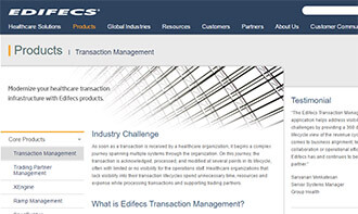
The product solution pages are key pages on edifecs.com because of the information they deliver. For companies like Edifecs, where sales cycles happen over many months or even years, users often come back to these solution pages for information. Selling products is not as good a strategy as selling solutions, and the pages were designed with that in mind.
By better standardizing page layouts, product owners and stakeholders could more easily produce consistent content. Many rules were set up to keep content limited but meaningful: word count ranges, stricter body copy guidelines, and graphics and diagram standards.
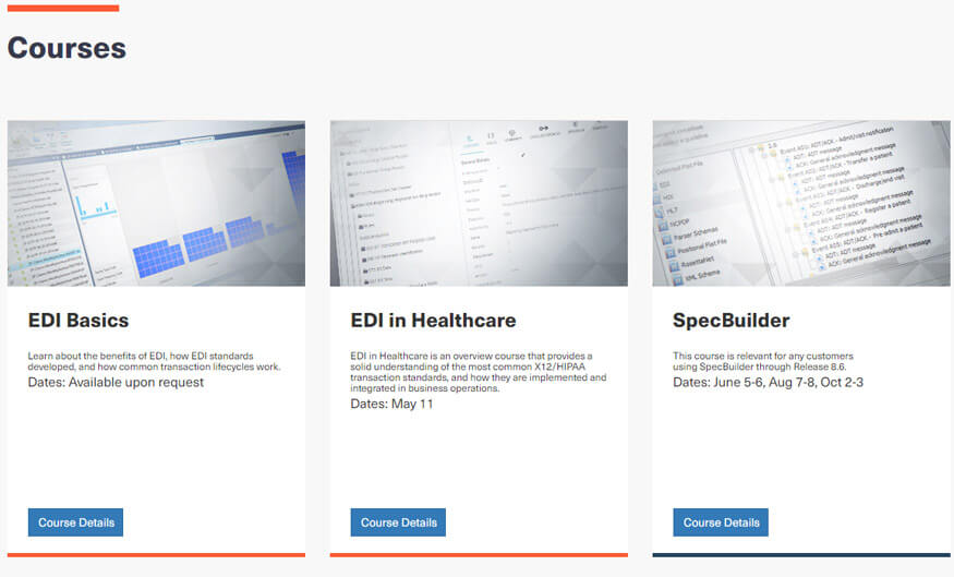
Trainings
A large new offering within 2.0 is a stronger education section. Solutions like Edifecs' require a level of mastery achieved through training and practice. Enterprise software purchasers know this, and when vetting solutions look to the complete support cycle offered. An entire microsite was designed to allow users to get the training they needed.
Development
Both the front and backend were overhauled during development. Because all content was being rewritten, very little needed to be ported over to the 2.0 site. Overall there was a development focus on speed, performance, and ease of use. Reducing overhead and shortening the time to commit new code and content were crucial moving forward.
Frontend: Responsive design became part of standard practice. Development set limitations on designs to not use performance-heavy modules too often on a single page, using many best practices to attempt consistent 60fps and overall fast rendering.
Backend: In 1.0, page entries contained content. 2.0 changed this so page entries only reference content modules. By separating all content into separate entry types, overall control and reusability was easily achieved. This structure allowed for greater permission management, as content creators could work more safely on content chunks rather than whole pages.
Integrations: Marketing automation solutions like Marketo were heavily used. The front and backend had these integrations in mind when being written, ensuring the company's business needs were supported without degrading user experience for site visitors.
Successes
Since launch, the 2.0 site has continued to evolve and grow:
- Traffic has increased while bounce rates have dropped
- Leads have been generated through improved user journeys
- Trainings have been sold through the new education platform
- The blog was awarded best healthcare IT blog after the first year
- Content creation became faster and more consistent with modular architecture
Conclusion
Completing design and development of the corporate website did not mean it was finished. With the new processes created, the web property continues to receive updates and new developments that provide more to the users' experience almost every day. The modular architecture and modern development practices ensure the site can evolve without requiring major overhauls for years to come.